· Different album cover on play.com
· popbitch
· Click to enlarge
· More Release Info stories
· More Index stories
· Also by davidt
Morrissey-solo
Archive
|
|
|
|||||||||
|
posted by
davidt
on Friday January 27 2006, @12:00PM
gonzo writes:
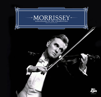
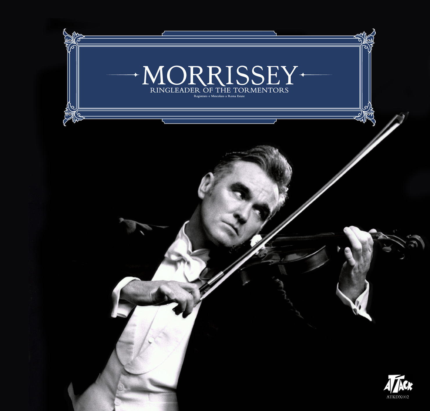
Different album cover on play.com. This looks like it's the final cover... and all I can say is wow!!! It looks great! Glad they replaced that initial font...wonder how play and HMV got hold of it? ---Naomi also writes:
This version of the new sleeve has been doing the rounds on the internet (I picked it off the popbitch message board), taking the Moz-does-deutsche-grammophon thing to its logical conclusion. I have no idea whether it's legit or not, but it's pretty hi-res and does have the Attack logo on it, complete with catalogue number. There's an Italian tag under the title - 'Registrato e Mescolado a Roma Estate' - which I don't feel equipped to say any more about.
This discussion has been archived.
No new comments can be posted.
Different / final album cover at online retailers, hi-res version posted on popbitch
| Top
| 120 comments
| Search Discussion
The Fine Print: The following comments are owned by whoever posted them. We are not responsible for them in any way.
(1)
|
2
(Morrissey-solo Overload: CommentLimit 50)
(1)
|
2
(Morrissey-solo Overload: CommentLimit 50)
|
|||||||||
|
| |||||||||
ugh (Score:0)
Re:ugh (Score:2, Insightful)
(User #6184 Info)
Parent
Re:ugh (Score:2, Insightful)
(User #6184 Info)
Parent
italiano (Score:2, Informative)
(User #13204 Info)
I don't know (Score:0)
I don't like it!! (Score:2, Funny)
(User #4562 Info)
Nice... (Score:3, Insightful)
(User #14959 Info)
I like it (Score:1, Interesting)
Pretty much all of Morrissey's solo album covers (Score:0)
(User #10663 Info)
Oh yes (Score:1)
(User #15063 Info)
perdy (Score:0)
wah wah wah
fits perfectly with songs' titles at least.
(User #14966 Info)
oh my... (Score:0)
Why Is He Always Looking To His Left?? (Score:1)
(User #8735 Info)
i must say (Score:0)
Good Choice! (Score:1)
(User #4574 Info)
shambolic (Score:0)
Popbitch's Message Board? (Score:1)
Assuming this is real, it seems the box needed to be added because the tag line in Italian would have been unreadable in scriptface. Font is OK, like an Old Style Goudy. I like the way the R's dip down.
The clip art boarder reminds me of those templates Martha Stewart sometimes includes in her magazine for ladies to copy and use for gift tags or jelly jar labels.
The first version of the photo had a nicer expression on Morrissey's face and he was looking up. The original comp also had a nice shadow added by his waist, so to make him blend in with the background and appear to look leaning forward. Here, he is shown off the edge. This version looks like the one used for the tour advert.
I liked the first version better but with a less weirder scriptface used. I am really looking forward to the single and album.
(User #11277 Info)
no way (Score:0)
Calling marc almond, come in marc almond...... (Score:0)
fake italian (Score:1, Informative)
Registrato e Mescolato a Roma Estate
(not Mescolado!! Naomi)
to be Italian should be something like
Registrato e Mixato a Roma, Estate 2005
(Recorded and Mixed in Rome, Summer 2005)
'Mescolato' can't be used in this context, you just can use it in a kitchen recipe
'Estate' loooks more like an english word, like 'Roma house estate'
'rome summer' in italian should be 'Estate Romana' but 'Roma Estate' has non sense at all
remo from MILAN. ITALY
new cover (Score:0)
A fake? (Score:0)
I do really hope that's a fake!
Me
Reasons I think it's fake... (Score:0)
2) That image of Moz playing the violin doesn't really work in the context of the album cover. The whole point of the original joke, was that it was advertising gigs at London's Palladium - a classical venue. That's why it wasn't used to promote the rest of the tour; just the Palladium specifically.
Finally, why has Remo (above) got a score of zero? He gave interesting (and apparently valid) information.
- Stu Walsh. Too lazy to sign in.
Curled Little Finger (Score:1)
Click to enlarge: How may I make this my new screensaver?!
(User #724 Info)
Catalogue Number... (Score:2, Interesting)
This coverart has the SAME catalogue number (ATKDX002) as Irish Blood, English Heart.
check it out...
http://www.amazon.co.uk/exec/obidos/ASIN/B0001XQ7
(User #152 Info | http://worldofabrahan.com/)
Same as: (Score:1, Informative)
http://www.classicalandjazz.co.uk/Classical/CD_Im
http://www.arte-tv.com/i18n/content/tv/02__Commun
please tell me you're joking.... (Score:0)
(User #7529 Info)
Excellent cover! Not sure where the "fake"... (Score:0)
As for the comments about this one being "fake" or too contrived. Keep in mind this is the same person that wore the fake hearing aid while singing on stage. The same person that had "fake" cuts, etc. carved into his skin for the Southpaw release. There are other instances. He has always done this sort of thing and it doesn't come off as forced to me and I'd think anyone else that realizes he's always done stuff like this is probably of the same mindset.
Another possible clue... (Score:1)
Of course, look at the covers of some of the YATQ-era singles. No offense, Moz!
(User #12174 Info | http://www.thischarmingband.net/)
i like it (Score:1)
its funny, cool and stuff
&
i aint care if its real or no
(User #13614 Info | http://www.churchofevil.org/)
at the time it is terrible (Score:1)
(User #12385 Info | http://www.livejournal.com/users/depressed_disco)
I don't like (Score:1)
(User #12046 Info)
I like it... although (Score:1)
(User #14866 Info)
Good! (Score:1)
(User #13943 Info)
Stradivarius Mozzus Rex (Score:1)
To those of you into scatology, whatever gets your rocks off, right?
(User #11921 Info)
Dramatic and breathtaking (Score:0)
Parabéns, Moz! Love you more and more because you just do what you want, and never what others expect you to!
why? (Score:0)
In the next single is Morrissey going to be in drag as Joan Crawford?
the cursive font we saw earlier this week... (Score:1)
i really liked th cursive font we saw earlier this week...
(User #152 Info | http://worldofabrahan.com/)
Cover (Score:0)
Oh come on (Score:1)
I just hope the new The Cure album will have also a cool cover like Morrissey's cover.
(User #13639 Info | http://www.librarium-online.com/)
This Picture Is Ugly (Score:0)
It's rather odd though. the header style v.s. the outfit style.
but whatever...its not the greatest but...at least its not pink and doesn't make Moz's head look like a large mellon on a stick.
the mozkateer
www.myspace.com/robertsaenz
(User #1871 Info | http://www.myspace.com/ofthetimes)
THis Is NOt The Cover (Score:0)
Why would it say recorded in rome...summer? Thats rediculous.
what probably happened was somebody got a hold of the other black and white cursive written photo of another fake cover and made this one. but the font sucks donkey dick..at least..it does with that suit he's got on.
i doubt this is the cover. not that it might not be the real photo for the cover...but...that box on the top is too...Vauxhall to be new.
i don't think so but we'll see.
saenz
the mozkateer
www.myspace.com/robertsaenz
(User #1871 Info | http://www.myspace.com/ofthetimes)
Not a fake (Score:2, Insightful)
It's on play.com
It. Is. Not. A. Fake.
We had EXACTLY the same discussion when the YATQ sleeve was released in drips and drabs before the final one was rubber-stamped. Perosnally - I think it's wonderful. I don't understand why people are being negative, but then they would be about just about anything. What makes me laugh are the people who say "I could do a better cover than this..." and in one hilarious case, when the title of the album was released, one tool said he had a much better name for an album (I forget what it was now...something that ended in "dear") and actually seemed quite hurt and dismayed that this wasn't the album title!
Look, Morrissey is an artist and must do as his muse dictates - by all means say if you don't particularly care for something or prefer something else, but don't claim you could do better- the whole point is you aren't the artist are you? It's like those guys who look at Jackson Pollock paintings and say "I could do that.." - yeah, but ya didn't, did ya?
What next - got some tennis tips for Roger Federer?
Rant over.
(User #335 Info)
Okay, I.. (Score:0)
The thing that has changed from before, is the typesetting. And a blue box around it. I like the typesetting... And when compared to Quarry and the singles... How in God's name can you compare!? Lets 'ave a look...
http://images.morrissey-solo.com/gallery/albums/u
http://www.amazon.com/gp/product/images/B0001WAO5
Aaaaand...
http://www.amazon.com/gp/product/images/B0001WDF6
Look at the last one.
Just look at it. And then you have the nerve to be unhappy with the type in the new one.. BLAH. The Quarry cover's typesetting was.. Okay, designed obviously BUT is just plain boring. Not boring as in dull, boring as in it's probably the most used sort of typesetting around right now and there is nothing unique about it whatsoever, which at the end of the day, is what ultimately matters.
The blue box is FABULOUS in my opinion. If I had created that, I would be very proud. In fact I'll probably sneak it into my.. Ssssshhhh
Mind you. The box is quite oddly, not centre aligned... Only slightly.
Just a quick question, is anybody else seeing bits of grey on black around the edges? Like areas of blurred lighter tone... My Mac for some reason has problems with photographs, so I was just wondering if this was the monitor.
gay (Score:0)
I love it (Score:0)
(please someone stop me before I make another Brokeback Mountain joke)
Nice pot... (Score:1, Funny)
hi (Score:0)
It's basically the same as the other one... (Score:0)
great (Score:0)
A lot of people on this site don't get the humour - but then a lot of you are illiterate children.
broken
i absolutely... (Score:0)
(User #14583 Info)
Fantastic cover Morrissey (Score:0)
(User #15133 Info)