posted by davidt on Wednesday September 22 2004, @08:00AM
Julian writes:

The cover for Moz's new single 'Let Me Kiss You' featured on www.amazon.co.uk (link) is completely different to the one posted on this site. Maybe both CDs will have different covers...


---
This discussion has been archived. No new comments can be posted.
Display Options Threshold/Breakthrough:
The Fine Print: The following comments are owned by whoever posted them. We are not responsible for them in any way.
(1) | 2 (Morrissey-solo Overload: CommentLimit 50)
  • Mmmmmm...gorgeous!!
    scarlette -- Wednesday September 22 2004, @08:02AM (#125774)
    (User #11977 Info)
  • I much, much prefer this cover.
    It's beautiful.

    I feel like I've seen that picture before, or another from the same shoot.
    Something about a clock, in a bar... oh I don't know.
    dallow_bg <[email protected]> -- Wednesday September 22 2004, @08:05AM (#125775)
    (User #10559 Info | http://www.dolefulorange.com/)
    "All the people I like are those that are dead."
  • much better than the other one, don't you think?
    NIcky's Cousin -- Wednesday September 22 2004, @08:06AM (#125776)
    (User #7181 Info)
    ...first day with the jar...
  • Great one and original photo
    Anonymous -- Wednesday September 22 2004, @08:07AM (#125777)
  • as someone who has worked in print graphics, design and typo for 15 years, can I just apologise on behalf of my industry for whoever did that lettering - its rank.
    Brighton Rich -- Wednesday September 22 2004, @08:09AM (#125778)
    (User #8270 Info)
    • Re:typo (Score:2, Funny)

      No, Rank is an old Smiths live album! :-)

      (Ahem....I'll get my coat...)
      Tottenham Tom -- Wednesday September 22 2004, @08:14AM (#125781)
      (User #11165 Info)
      "I don't sound like nobody"
    • Re:typo by Anonymous (Score:0) Wednesday September 22 2004, @08:20AM
      • Re:typo by Brighton Rich (Score:1) Wednesday September 22 2004, @08:55AM
        • Re:typo by freeyourself (Score:0) Wednesday September 22 2004, @09:15AM
          • Re:typo by Anonymous (Score:0) Thursday September 23 2004, @05:39AM
          • Re:typo by Cazza (Score:1) Thursday September 23 2004, @05:43AM
    • Re:typo by Biscuit Buscemi (Score:1) Wednesday September 22 2004, @09:24AM
    • What are you talking about? by Anonymous (Score:0) Wednesday September 22 2004, @10:51AM
    • Re:typo by Anonymous (Score:0) Wednesday September 22 2004, @01:11PM
    • Re:typo by Eric Hartman (Score:1) Wednesday September 22 2004, @04:01PM
      • Re:typo by Anonymous (Score:0) Thursday September 23 2004, @12:51AM
    • Re:typo by boingo79 (Score:1) Wednesday September 22 2004, @04:30PM
      • Re:typo by Diasco (Score:0) Wednesday September 22 2004, @11:29PM
  • they've actually got this cover on the HMV site now aswell so this must be the official cover.
    NIcky's Cousin -- Wednesday September 22 2004, @08:10AM (#125779)
    (User #7181 Info)
    ...first day with the jar...
  • I wish he'd combed his hair.
    Nine Times Fine -- Wednesday September 22 2004, @08:14AM (#125782)
    (User #9704 Info)
    for haven’t you me with you now?
    • Re:that do by jay m (Score:1) Wednesday September 22 2004, @04:45PM
    • Chica Latina Bangs by InterestingDruggie (Score:1) Wednesday September 22 2004, @09:21PM
  • ...it's 'bout time we got a decent cover.
    Anonymous -- Wednesday September 22 2004, @08:16AM (#125783)
  • Morrissey is really gorgious. And more than before. And it's obvious since the malajusted dreadfull sleeve... I so much like the way he's dressed now and the smartness he has in concert or video. This charming man is STYLE.
    YANN
    Anonymous -- Wednesday September 22 2004, @08:17AM (#125784)
  • This photo is much classier, and newer than the original HMV piccy. The HMV picture had been doing the rounds for months as a promo picture (from the original Greg Gorman session) and it was really disappointing to it recycled on Let Me Kiss You. But now all is explained. The song may be mediocre but this is the best cover art of the comeback.
    JonnersB -- Wednesday September 22 2004, @08:21AM (#125786)
    (User #8247 Info)
    Would you like to note my inside-leg?
    • Re:Much better by GLEGS (Score:1) Wednesday September 22 2004, @02:34PM
      • Re:Much better by Anonymous (Score:0) Wednesday September 22 2004, @02:45PM
        • Re:Much better by JonnersB (Score:1) Thursday September 23 2004, @01:29AM
          • Re:Much better by GLEGS (Score:1) Thursday September 30 2004, @03:57PM
  • Is it just me or does it look like this picture of Moz was taken in around 1990?
    Anonymous -- Wednesday September 22 2004, @08:21AM (#125787)
    • Re:Old pic? by mspendl828 (Score:1) Wednesday September 22 2004, @08:41AM
      • Re:Old pic? by Anonymous (Score:0) Wednesday September 22 2004, @09:42AM
    • Re:Old pic? by Anonymous (Score:0) Wednesday September 22 2004, @06:43PM
  • where's his other arm?
    Anonymous -- Wednesday September 22 2004, @08:23AM (#125788)
    • Re:er... (Score:2, Funny)

      He lost it in the lawsuit to Mike Joyce perhaps?
      pezboy2u -- Wednesday September 22 2004, @09:45AM (#125823)
      (User #11848 Info)
      "you're like f*ckin Job, everything happens to you"
    • Re:er... by ArrigoXX (Score:1) Wednesday September 22 2004, @11:57PM
    • 2 replies beneath your current threshold.
  • that it is MUCH better.. I really hope that the US version uses this cover.
    neondisease -- Wednesday September 22 2004, @08:28AM (#125791)
    (User #2039 Info | http://www.girlfrommars.com/)
  • I very much approve of this cover, he's looking lovely and it's far better than the other one.
    I'm not Sorry -- Wednesday September 22 2004, @08:32AM (#125793)
    (User #12338 Info)
  • by far
    Anonymous -- Wednesday September 22 2004, @08:32AM (#125794)
  • I wonder if the single version will be remixed to include the trumpet bridge that they have been doing in the live versions? I hope not, as I must prefer the piano.
    Anonymous -- Wednesday September 22 2004, @08:37AM (#125797)
  • Should've been the album cover!
    Anonymous -- Wednesday September 22 2004, @08:41AM (#125798)
  • i likey this one much more. reminds me of those old vauxhall promos.
    eugenius -- Wednesday September 22 2004, @08:41AM (#125800)
    (User #1665 Info | http://www.cherryplucker.com/)
    I'm almost sure you can do better than that.
  • is a great sleeve!
    herzeleid316 -- Wednesday September 22 2004, @08:42AM (#125801)
    (User #7475 Info)
  • I also think this the best cover of the entire Quarry lot.
    someraincoatedlovers -- Wednesday September 22 2004, @08:46AM (#125803)
    (User #10290 Info)
  • the font is an atrocity. There was a time when moz cared about these things...
    Anonymous -- Wednesday September 22 2004, @08:53AM (#125806)
  • A vast improvement! The other cover made him look like a paedophile- or worse still like some sort of cheesy compere at Butlins...

    With the looks of Ted Bovis and the personality of Bobby Chariot.

    Although I fear the quiff is begining to show signs of will.
    bobmozza -- Wednesday September 22 2004, @08:55AM (#125809)
    (User #6533 Info)
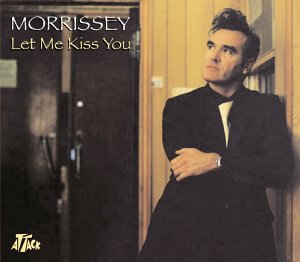
  • Photograph details (Score:1, Informative)

    This was one of a couple of photographs used to accompany the Sunday Times interview back in May. The photographer was Hamish Brown - same guy who took all the NME shots in May.
    Always wondered as to the location of this shoot, as it doesn't look like an L.A location even though that's where the shoot reportedly took place. Looks more like a Widnes railway station, c.1965
    It would seem that someone has taken the hint from Requiescant Inpacce and put these beautiful images to wider use.
    Anonymous -- Wednesday September 22 2004, @09:06AM (#125812)
  • comeback to camden, baby! now this is YOU Morrissey...you look mahvelous.
    billybud71 -- Wednesday September 22 2004, @09:08AM (#125813)
    (User #555 Info)
    We are the change that we seek.
  • ...the Man is absolutely handsome!
    sonnet29 -- Wednesday September 22 2004, @09:19AM (#125815)
    (User #4574 Info)
    My love, wherever you are, Whatever you are...Don't lose faith...I know it's gonna happen someday...
  • VERY NICE
    VERY NICE
    VERY NICE !!!! and not in a next world !

    Guillaume M
    Paris
    Anonymous -- Wednesday September 22 2004, @09:27AM (#125817)

  • he looks about 10 years younger here...
    Anonymous -- Wednesday September 22 2004, @09:56AM (#125828)
  • Style, class, sophistication, moody, and modern.
    Best cover pic since My Early Burglary Years.
    mick ransommich -- Wednesday September 22 2004, @09:57AM (#125830)
    (User #8642 Info)
    'Two roads diverged in a wood and I, I took the one less travelled by. And that has made all the difference'.
  • buy both and feel deceived
    Anonymous -- Wednesday September 22 2004, @09:57AM (#125831)
  • It is gorgeous, just stunning. Much, much better than the other cover.
    cyanide rose -- Wednesday September 22 2004, @10:36AM (#125837)
    (User #7911 Info | http://murderess.net/)
    Popularity is an insult I have never suffered. - Oscar Wilde
  • font still sucks. He should have had one font to carry the entire theme of the You are the Quarry singles and promos. This looks like papyrus in word.

    The photo is at least decent. I would agree with others that overall the visual aspect of this effort sucks. At least the videos are good. Esp Irish Blood.
    Anonymous -- Wednesday September 22 2004, @10:39AM (#125838)
  • if you look at it--real quick like
    thirsty fists <[email protected]> -- Wednesday September 22 2004, @10:48AM (#125840)
    (User #149 Info)
    "world's ugliest boy"
  • As said, its a nice photo, far nicer then the two singles past, but what does it actually have to do with the song? There is no connection at all, and that font is truely terrible. While Morrissey is making some of his best music in years, he's definetly making the worst record sleeves.
    Anonymous -- Wednesday September 22 2004, @10:49AM (#125841)
  • oh you handsone devil!
    Anonymous -- Wednesday September 22 2004, @11:19AM (#125846)
  • It is gorgeous, but the other sleeve goes more with the general theme that his sleeves have had recently, doesn't it? That mocking slightly trashy glitzy feel. You're right about the font though - it looks like someone took that fantastic photo and threw on a title in Microsoft Paint or something...
    charming lass -- Wednesday September 22 2004, @11:26AM (#125850)
    (User #11741 Info)
    this is the last song i will ever sing, oh no i've changed my mind again
  • I would like to know what those of you who are calling the font 'rank', 'atrocity' and other such over-the-top expressions, have against it? In what way is this font wrong? I'm not saying I'm fawning over it and that it's the most luscious and lovely font ever, but certainly it is not as bad as some of you are saying. I see it as having a little style and character. Better than the IBEH single, which was just plain silly looking. But I would really like some of you to explain why you think the font is so hideous.

    Besides, Morrissey is looking at the font in the picture and he doesn't look so vexed, so why are you?

    - Truer Poetry
    Anonymous -- Wednesday September 22 2004, @11:33AM (#125852)
  • I like it. Much more Moz. I remember when his single covers used to be more artistic. This one goes back to a similar formula. The IBEH single was also great. I wasn't too crazy about the FOTGTD cover. Maybe Moz doesn't have the time or patience for photo shoots like he used to, or maybe Linder has been busy. I agree with one of the above posts: The previously posted photo for this single did make Morrissey look like a molester. Definitely the wrong image for Sanctuary to put out. As a matter of fact, that whole photo shoot didn't look right. Let's face it, he lives in a big house, hardly talks to people, and there are questions about his sexuality. All he needs are one of those big old GMC vans and that seals the deal. Seriously though, they should keep this sleeve as the only one. Memo to Sanctuary: Make our MAN look good. Quit with the creepy poses and backgrounds.
    Jim Rome -- Wednesday September 22 2004, @11:48AM (#125854)
    (User #720 Info | http://www.jimrome.com/)
    ...and how?
  • Oh, I agree, this is SO much better than the other sleeve! He looks absolutely gorgeous in this one, and the clothes are better too - verah stylish! Yeah, the font is a bit of a let-down, but look at how great Moz looks... Mmmmmph! I really didn't like the FOTGTD sleeve, that was just bad. But yes, definitely a vast improvement on the other sleeve.
    fishnet_monkey -- Wednesday September 22 2004, @11:51AM (#125855)
    (User #12209 Info | http://officefurniture.livejournal.com/)
    "But we cannot cling to the old dreams anymore, no, we cannot cling to those dreams..."
  • Can anybody confirm that this is DEFINITELY the sleeve and not the other, hideous "glittery" effort that we were presented with a few days ago?

    This is MUCH, MUCH better. The first Quarry-related sleeve that I've actually thought was very good. Very nice photograph indeed, Moz does look slightly younger in it so it may be older, but so what? I actually thought that the 'Under The Influence' sleeve - clearly of his younger self - was superb, so no probs with that strategy at all. The font is fine/ FOTGTD, despite having a vile cover, had the best font to date, but this is perfectly acceptable and goes well with the excellent photo. Maybe someone from Sanctuary read the comments on here about the last photo and clicked that we all hated it. I know one or two people said it fitted the "glamour" image he is/was trying to cultivate, but there's no two ways about it, the first cover was tacky, this cover is tasteful and sophisticated. I hope this signals a return to the carefully considered artwork of his past releases. Very nice indeed. And I DO hope this genuinely is the cover. Far and away the best of the Quarry related artwork. If only the album cover was less hideous and more like this. Excellent stuff.
    Anonymous -- Wednesday September 22 2004, @12:13PM (#125863)
  • Absolutely beautiful!!!! Now that is what I am talking about!!!Delicious!!!
    Mozana -- Wednesday September 22 2004, @12:31PM (#125869)
    (User #11618 Info)
  • Just like everybody here I like it !
    Bridget -- Wednesday September 22 2004, @01:47PM (#125881)
    (User #10891 Info)
  • Nasty font. And nasty picture - all his old singles used to have really good photos on the sleeves. The new ones look like some amateur 'cut and paste' job. Yak yak yak...bring back the black and white sleeves i say.
    Anonymous -- Wednesday September 22 2004, @02:48PM (#125892)
  • Moz looks like a vampire on this sleeve...
    **cue: lots of comments from obsessives about Mozza sucking their blood**

    He he!
    Anonymous -- Wednesday September 22 2004, @02:51PM (#125894)
    • Re:Hmmm.... by Anonymous (Score:0) Wednesday September 22 2004, @02:54PM
    • Re:Hmmm.... by Poppycocteau (Score:1) Thursday September 23 2004, @05:43AM
  • From the look on his face i'd be fascinated to know what he is contemplating kissing...
    carnal artist -- Wednesday September 22 2004, @03:03PM (#125899)
    (User #7076 Info)
  • The font? Panties in a bunch over the font?

    Those who are complaining about the font have ABSOLUTELY NO life whatsoever!!

    Only a Morrissey fan could be so petty.
    Anonymous -- Wednesday September 22 2004, @03:15PM (#125904)
  • so much better. excellent cover shot. not huge on the font, but who really cares? Moz looks wonderful.
    chrisarclark <[email protected]> -- Wednesday September 22 2004, @04:37PM (#125918)
    (User #9259 Info)
    "I'm just passing through here on my way to somewhere civilized and maybe I'll even arrive, maybe I'll even arrive..."
  • i'm not buying it because of the font. plain and simple. what a fucking disaster.
    Anonymous -- Wednesday September 22 2004, @06:20PM (#125930)
    • Re:wtf by Anonymous (Score:0) Wednesday September 22 2004, @06:55PM
    • Re:wtf by Meatfreecotter (Score:1) Thursday September 23 2004, @04:37PM
    • Re:wtf by Watto (Score:1) Thursday September 23 2004, @05:19PM
      • Re:wtf by Anonymous (Score:0) Thursday September 23 2004, @08:06PM
    • Re:wtf by Stan (Score:1) Friday September 24 2004, @08:58AM
  • Much better good sleeve,
    I don't like another sleeve,
    Anonymous -- Wednesday September 22 2004, @07:17PM (#125935)
  • For all you Cure fans creeping into Moz-solo what do you think about Moz compared to out of shape Mr. Smith? Good Night And Thank You!
    Anonymous -- Wednesday September 22 2004, @07:40PM (#125936)
  • doesn't make it a good choice for a cover.

    As soon as I saw it I thought yes, it's way better than the shower scene, but no, it's wrong for a single sleeve. It looks so old and outdated. Unlike numerous Smiths and Morrissey covers, this will be forgotten a few weeks after its short chart flurry. This has nothing to do with the song it's trying to sell.

    Anyone remember Lloyd Cole? Or hundreds of 90s Nashville wannabes? Or even Sir Cliff? They all had very similar cover shots. Or just paste Enya's face over it and hey presto, a huge hit - the font is absolutely perfect for her. Very MOR, not very Moz.
    Anonymous -- Wednesday September 22 2004, @07:49PM (#125937)
(1) | 2 (Morrissey-solo Overload: CommentLimit 50)


[ home | terms of service ]